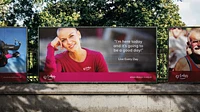
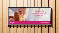
Rebranding St Luke's Hospice
Stories of pride, passion and emotion.
St Luke’s is a lifeline for hundreds of adults across Sheffield suffering from a range of incurable illnesses. Through compassionate, expert care and effective pain management, they give patients and their families the opportunity to make the most of their time together.
The doctors, nurses, and carers at St Luke's believe that quality of life every single day is what truly matters. Working at the forefront of research and education, the care team constantly pioneers new ways for patients to maintain the normalcy of everyday life and leave a positive legacy for loved ones.
This care is offered free to all who need it, made possible only by our dedicated volunteers and generous fundraisers. Each shares our passion, values the importance of this work, and feels grateful to be fit and able to contribute—helping patients to Live Every Day.
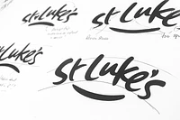

It was clear from the outset that the charity had ambitious growth aspirations and a desire to shift its brand focus. Our research into the palliative care sector revealed a landscape of conventional branding, where flowers, birds, and pastel shades were the norm. Wanting to break away from this, we proposed something far more contemporary and distinctive.
The existing identity posed several challenges: a multi-coloured logo with awkward shapes made it both difficult and costly to reproduce, especially on clothing and merchandise. While previous brand messages focused primarily on patients, our goal was to broaden the appeal to include volunteers, medical teams, fundraisers, marathon runners, and innovators.
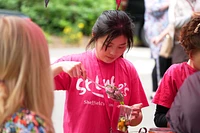
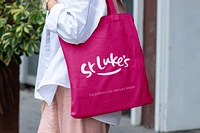
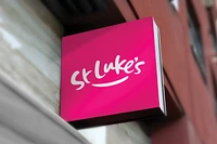


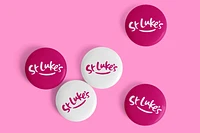
The result was a bold and striking signature-style identity inspired by the personal stories of real people in the hospice. A bespoke, handwritten logo was created in collaboration with lettering artist Ruth Rowland, and a bright magenta pink was chosen for maximum impact.
This single-colour identity is both easy and cost-effective to reproduce and now adorns shops throughout Sheffield, as well as running vests, banners, balloons, and bunting. The proposition, Live Every Day, brought a positive tone of voice, encouraging patients, families, and friends to make the most of the time they have left together.

Working with Ledgard Jepson on the rebrand of St Luke’s has been an extremely positive experience. Right from the start, from the creation of the design brief they were keen to get under the skin of St Luke’s and where it needed to go. They consulted with us at every step of the journey, seeking our opinion, guiding where necessary, and exploring whatever avenues we asked them to, which made for a really creative and robust new visual identity that is aligned with our ambitious new plans.
SU HEMMING HEAD OF MARKETING, ST LUKE’S HOSPICE
