Rebranding Birmingham Museums
Rebranding Birmingham Museums, the largest trust of its kind
Birmingham Museums is a charitable trust that cares for a collection of over one million objects across nine museums on behalf of the City Council and the people of Birmingham. The properties include the Birmingham Museum and Art Gallery, ThinkTank Science Museum, Museum of the Jewellery Quarter, Aston Hall, and Soho House.
The museums provide a fascinating glimpse into Birmingham's rich and vibrant past and showcase world-class museum collections, including the largest collection of Pre-Raphaelite paintings in the world.
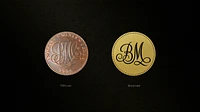
The overarching Birmingham Museums logo was inspired by a fascinating story we stumbled upon during our research. Matthew Boulton, a famous son of the city, was an engineer and industrialist with a thirst for innovation. In 1790, he struck the Anglesey Halfpenny, the world’s first modern coin, which was perfectly round, making it difficult to counterfeit. It was made on the first steam-powered press, making it a perfect story to epitomize the city’s history of innovation. On close look at the halfpenny, the swirly initials in the centre that read PMC could quite easily be read to read BMT, the initials of The Birmingham Museums Trust.
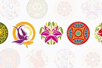
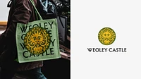
The circular design of the overarching logo provided us with a perfect device to encompass all nine logos. Each roundel tells a unique story of its own, from the squirrel at Aston Hall to the lion head tile at Weoley Castle, the lily at Blakesley Hall, and the floor detail at Soho House, with each unique icon crafted with precision by our design team. The typography for each identity is also unique, drawing inspiration from each venue and armed with comprehensive guidelines had a detailed brand platform to provide consistency across nine properties.
The circular design of the overarching logo provided us with a perfect device to encompass all nine logos. Each roundel tells a unique story of its own, from the squirrel at Aston Hall to the lion head tile at Weoley Castle, the lily at Blakesley Hall, and the floor detail at Soho House, with each unique icon crafted with precision by our design team. The typography for each identity is also unique, drawing inspiration from each venue and armed with comprehensive guidelines had a detailed brand platform to provide consistency across nine properties.
Aston Hall brand story
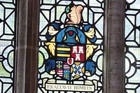
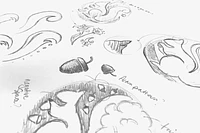
During our visit to Aston Hall, we discovered the Holt family crest belonging to Sir Thomas Holte, who was responsible for building the hall between 1618 and 1635. The squirrel, which sits at the top of the crest, is a widely used symbol and provided us with an ideal starting point. We incorporated details from the surrounding gardens and used a Jacobean-style flower and leaf pattern to enhance the design.

David and his team went above and beyond, and it was clear from the outset that working on our brand was a labor of love. They poured passion and energy into learning about and uncovering the stories from each site, immersing themselves in the history of the city. Most importantly for the trust, they guided us carefully through each step of their process, making suggestions and adjustments along the way, which made for a truly enjoyable and positive experience.
Andrea Fox – Marketing and Communications Manager

During our visit we discovered a family crest, belonging to the Holte family. Sir Thomas Holte was responsible for building the hall between 1618-1635. The squirrel, which sits at the top of the crest is widely recognised and has several references throughout the site. This gave us a great focus point.
We also wanted to use the park and gardens as a Jacobean style pattern to help add detail and flexibility in order to continue the circular design theme.

